Wednesday, June 10, 2015

Final Exam


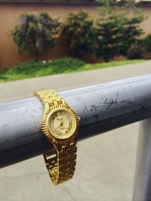
4. At the amusement park I work at, we often have to take pictures for the guests. This is all I knew about photography. I would try to keep the photo centered, not leave too much space at the bottom, and make sure everyone is posing appropriately. In the first month of DP, I started to learn about real photography (not just the tourist-y pictures I had been taking the past two years). Kaitlyn taught me a lot about angles, lighting, finding the right background, etc. The photo above was the first time I applied what she taught me. Right now, I don't like it as much as I liked it before. The photo is a bit out of focus and the yellow/purple tints don't look the way I'd like them to. But this photoshoot, nonetheless, was the first to change my view on photography.

5. Shape/Form post- it's combined because I was absent and was told to put all my missing Elements of Art photos in one post.
Shapes are flat and express only length and width. Forms are three-dimensional and express length, width, and depth.

6. Pattern/Repetition post- it's combined (along with a few other Principles of Design) because I was absent and was told to put all my missing Principles of Design photos in one post. Make sure to scroll down!
Patterns are repeating objects/symbols. Repetition is like pattern, but on repeat. It makes the photo more fluid.


My best project was the one-word project. Although my photos follow the format of my group's photos, there is a bit of my creative expression in the way I had my subjects pose and which poses I chose for my final work. These photos also look better than the photos in my other projects. I was able to focus the camera and make my photos look similar to the rest of my group's, so they don't stick out as different or incorrect. This project showed me that I can still be creative when given a rubric. I learned to see that no set of rules could truly mask my creative abilities.

Monday, June 1, 2015

Student Website Reviews

First Period: Lucy Szeto
Favorite Photo
I find this photo interesting because it looks as though the watch is on display, while it's really just wrapped around a hand railing. It draws the eye in an otherwise mundane environment.

Second Period: Estell Kim
Favorite Photo
I like this photo because it looks almost candid. The friends look like they are genuinely enjoying themselves.

Third Period: Lucas Williams
Favorite Photo
I really like his entire project. The photos force a different perspective. This is my favorite photo in the gallery because it actually looks like the world's on its side, and very obviously shows that it's not (the water is pouring out of the bottle).

Monday, May 11, 2015

Dave Hill Inspired Photo

Original:
Edited:
Edits:
-decreased highlights
-increased saturation
-increased contrast

Photoshopped:

Friday, May 8, 2015

First Commercial Shoot

Photographer: M.C.
Photographer: Cara
Photographer: Haroon
Photographer: Kaitlyn

Thursday, April 23, 2015

Best Picture

Favorite Photographers
1. Yousuf Karsh
2. Gordon Parks
3. Alfred Stieglitz
4. David LaChapelle
5. Sally Mann

Photo Story MCW

Last First Day
I went home after my first last day of multicultural week.
Gyros
A story-worthy lunch.
Phogettaboutit
It was a little expensive.
Bhangra Practice
I had just gotten my hair dyed and I wanted to show my best friend. I had shown up a little too early for bhangra practice.

The Dance
A picture I sent to my older sister. Yes, Mr. Hui still does "the dance" (although I'm pretty sure he doesn't call it that).

Thursday, April 16, 2015

Story with a photo - Gyros

I might be the only person at our school who eats gyros. I guess not a lot of people know what they are, or something. No one is ever at the gyro booth. They always look so happy whenever I buy one. It's great. It feels like I'm the one keeping them in business. I control their fate.


Wednesday, April 15, 2015

MSJMCW Story

"Multicultural Week is the best week of the year! It may be even better than homecoming!" I couldn't help but laugh. What was my older sister thinking? Sure, I was only a freshman (and she was a senior), but I could tell anything called "Multicultural Week" wasn't going to be very fun. She went on about senior bhangra and performances in the gym and I tuned her out. Wow, dress-up days, club fundraising, and assemblies. It didn't sound all that enticing.
I left my fourth period class and was nearly trampled to death. Kids were running, full sprint, for the horseshoe. Maniacs! I thought. I followed them at my own pace until I realized what they were so excited about. Food! All kinds of food: everything from fast food to dishes that were made right in front of us. I wish I had asked my mom for more lunch money.
The name can be a bit misleading. Yes, it is supposed to be about appreciating diverse cultures. But, really, it's just an amazing food-fair. Which isn't all that bad, to be honest.

Monday, April 13, 2015

Principles of Design

Emphasis-
Here is some of the plantlife at MSJ. It was planted as part of the campus beautification project.
(Original)
(Edited)
Edits:
-decreased brightness
-increased vibrancy

Movement-
Here is some of the plantlife at MSJ. It was planted as part of the campus beautification project.
(Original)
(Edited)
Edits:
-decreased contrast
-lowered clarity
-cropped

Pattern-
Clarissa and I talk during our photoshoot.
The pattern is the crossing of the design on the table.
(Original)
(Edited)
Edits:
-decreased exposure
-decreased highlights
-decreased shadows

Repetition-
Clarissa and I wait to be let back into the classroom.
The repetition is the pattern of three lockers, that continue away from Clarissa down the hallway.
(Original)
(Edited)
Edits:
-cropped
-decreased exposure
-decreased highlights
-increased shadows
-increased contrast
-increased saturation

Proportion-
My cat falls asleep on my dad's leg in an awkward position.
(Original)
(Edited)
Edits:
-decreased exposure
-decreased highlights
-increased shadows
-decreased saturation

Rhythm-
At work, we used an old, plastic Christmas tree for our gift exchange.
(Original)
(Edited)
Edits:
-decreased highlights
-increased shadows
-decreased contrast
-increased saturation

Variety-
I visited a friend at the zoo she volunteers at. A coworker of hers shows a crowd of excited children a skink.
(Original)
(Edited)
Edits:
-cropped
-decreased highlights
-decreased shadows
-decreased contrast
-decreased saturation

Unity-
Here is some of the plantlife at MSJ. It was planted as part of the campus beautification project.
(Original)
(Edited)
Edits:
-increased vibrancy
-increased shadows

Elements of Art

Shape-
My cat sits in any container she can fit in- even some she can't fit in.
The shapes in this photo are the rectangular box flaps. They are flat.
(Original)
(Edited)
Edits:
-cropped
-rotated
-decreased exposure
-increased highlights
-decreased shadows
-decreased saturation

Forms-
My friend and I make a pie for pi day. (3/14/15)
The form in this photo is the oven. It is three-dimensional and expresses depth.
(Original)
(Edited)
Edits:
-increased exposure
-decreased highlights
-increased shadows
-decreased brightness
-increased saturation

Thursday, April 2, 2015

Shutter Speed And Everything After

Partner: Alvina Cheng

1. Fast or slow - why?
It is fast because the trucks that are not involved in the accident are still moving on the highway, but they are still focused on and not blurry.

2. One rule of composition per person, with an explanation.
Alvina: Leading Lines because the lines on the highway and the railings are going the same direction.
M.C.: Depth of field because you can see the cars down the highway just past the fallen truck.

3. Element of Art - list one with an explanation
It shows form because the trucks are three-dimensional and it expresses length, width, and depth.

4. Principle of Design - list one with an explanation
It shows movement because the viewer's eyes travel to the main point the scene which is the fallen truck. The attention is then drawn into the other trucks who are still moving on the other side.


Tuesday with Farley's Kids


 original


temperature: 0
tint: 0
exposure: -0.40
contrast: +5
highlights: -12
shadows: -15
whites: -64
blacks: -30
clarity: +34
vibrance: 0
saturation: 0

I darkened the picture and cropped it so the subject is closer. We can also see the background clearly. I also made it darker to where the clouds in the sky and the grass's shade are more distinct.

Friday, March 27, 2015

Lens Blog - Variety

We chose photo 6.

To me, variety in photography means picturing different subjects that don't distract from each other, and instead can be appreciated individually. The pots, pans, debris, etc. draw the eye and display good use of variety in this photo.

Wednesday, March 25, 2015

Elements of Art- Texture

Here is some of the plantlife at MSJ. It was planted as part of the campus beautification project.

Original
Edited:
Increased clarity
Increased shadows
Increased whites